Digital post-processing
Aug. 2, 2012I'm far from being a photoshop/gimp guru however, this is not intended to be a tutorial for experts and pros. Just a few simple notes for beginners.
1. Proper exposure is important. No matter the powers of photo-editing software, underexposed areas are grainy, which is not at all aesthetically pleasing in digital photos. Furthermore, both over- and underexposed areas lose a great amount of detail. This seems to be much more severe in digital than in analog photos. The acceptable-exposure range of a film is larger than of a digital chip.
2. That said, it's probably better to shoot in raw than in jpeg, to mitigate the effects mentioned above. Besides other things. For post-processing, I use gimp exclusively. Raw (Nikon .NEF) photos are handled with UFRaw plugin.
3. The general rule of a thumb I use, with a few exceptions, is that less is more. What I like about photos, besides a fresh perspective, interesting composition, and proper focus where it is desired, are clean and popping colors, and the right amount of contrast, with good definition of details in black&white pictures. What I don't like are overdone HDR, skin-smoothing, and color-obscuring techniques (I speak to you, Instagram).
4. Now to UFRaw and gimp: Let's start with UFRaw. The native gamma (luminance) compression/expansion parameter 45 seems too large for my taste (too dark shadows) in most lighting conditions. I usually lower it to 40, and would go even lower but that also results in more grain. Unless the photo or some of its areas are overexposed (which is sometimes unavoidable without a proper optical filter), I mostly adjust the curve setting in the shadow range. Often the shadows seem way too dark but again, be careful because the more you deviate from the native settings, the lower is the resulting photo quality.
What I don't like about digital photos is that they look differently on each screen. Often, especially when shooting on a cloudy day, I enhance the color saturation by about 10%. For black&white pictures, the value/color curves and contrast settings can be manipulated more freely. With colors, unless the editing is selective, such approach could make colors look awkward and unnatural, like bright pink skin. I usually set grayscale mode to "channel mixer", to mimic the effect of using optical color filters (I actually bought some but am lazy to use them).
When shooting in the middle of the day, the pictures tend to have a bluish tint. Increasing color temperature comes handy. If you don't have this option directly, open "curve settings", suppress the blue curve, push up the red one. This can be applied directly to a jpeg using gimp. Most of the other edits maybe as well, but I use UFRaw. One more trick: Open Colors -> Levels, and adjust input-levels sliders to mark the leftmost and the rightmost ends of the histogram. This stretches the tone-scale to cover the entire light spectrum, so the darkest shadows become black and the lightest highlights become white. Generally, it improves the "flat" impression of the picture. There are notable exceptions, like that the mood of a heavily overcast day is better expressed using darker shades, while an image of a sunlit forest with beams of light looks better in bright tones (reference: Bruce Barnbaum).
5. "Artistic" processing: This I usually avoid since I don't think it fits many photos. Anyway, here are a few techniques:
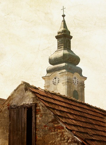
a) Textures: I sometimes use paper textures to give a slight "paint"-feeling to the images of towns. The paper texture and the original image are edited in two separate layers, where I play with blending modes (normal, screen, overlay), and layer opacities. I also adjust color levels to get the effect of "bold" colors of a painting.
b) Cross-process: The effect of developing a color negative in the chemicals for slides, and the other way around. I never tried it since being afraid to destroy the film. Somewhere I found the following way to mimic the effect digitally, albeit the result looks quite different from the real-thing examples I've seen: Open "Curves". For the green and the red ones, decrease shadows, increase highlights (increasing contrast), like sin x function in (-Pi, Pi). For the blue one, increase the curve in shadows, decrease in highlights (decreasing contrast), like sin x in (0, 2Pi).
c) Vintage-look: Apply the following color levels: Blue and magenta in screen mode, yellow in multiply mode. Set opacities of the first two between cca 5-15%, and of the latter one to 30-60%. This results in a faded-color, yellowish image. To increase the image definition, duplicate the original image layer, and set to overlay mode. Adjust the opacity to get the right level of definition.
Side-note: IMO, nature looks best without any "artistic" edits.
![]()
Copyright © Miroslava Sotakova, 2012