March 2013
May 6, 2013
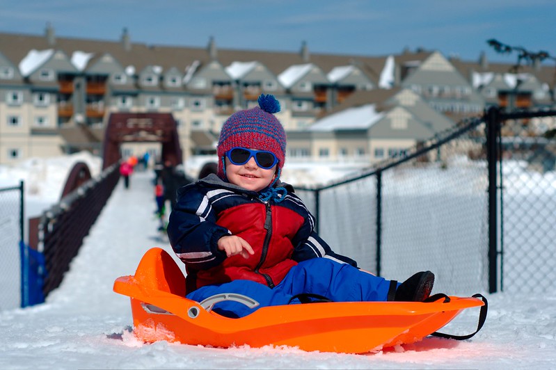
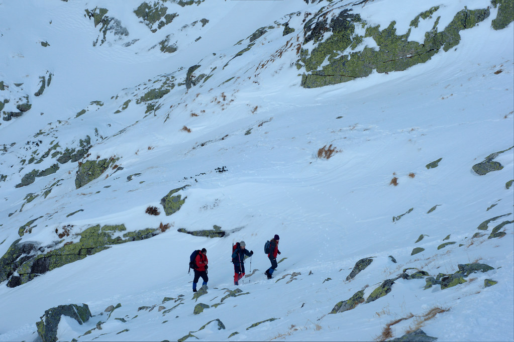
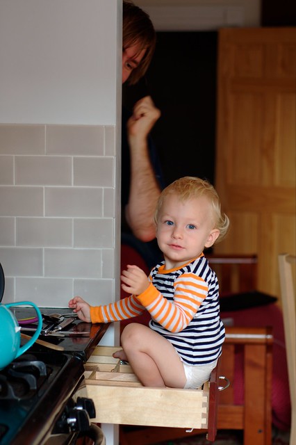
Our ski trip, originally planned for February (but we were sick) finally happened. There was quite a lot of snow but perfect spring weather in Killington, Vermont. We all had a lot of fun. A week after Stanko celebrated his second birthday, but the weather that day wasn't quite photogenic - very grey and slushy. It wasn't until two weeks later when he could finally try his new scooter outside - and he's really quite good with it, given his age. Finally, there was Easter with painted eggs and Michal's outstanding marmor cake.
February 2013
May 6, 2013
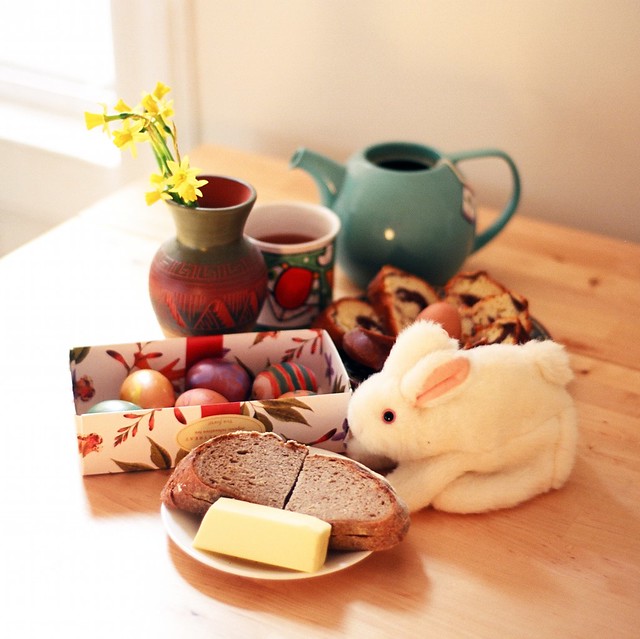
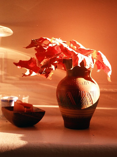
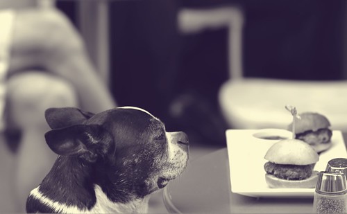
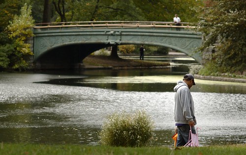
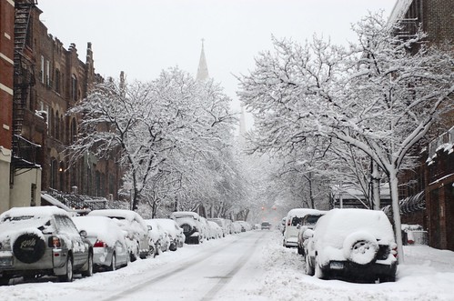
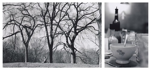
So we've been sick for almost the entire month, passing germs from one to another. The only notable trip outside the city was to Pocono Mountains and historic mining town Jim Thorpe in Pennsylvania. The outtake however is a minimalistic and almost mono-chromatic still life picture from one February morning at home, even though the composition is not perfect. The vase comes from Monument Valley. The leaves from Prospect Park in Brooklyn, found some time in November. So it's a perfect marriage of the East and the West. The other one is the photo of our little friend Nathan having brunch in the restaurant across the street from where we live. It's the light in his blonde hair that I like.
January 2013
Feb. 16, 2013
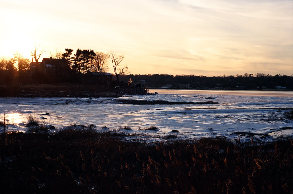
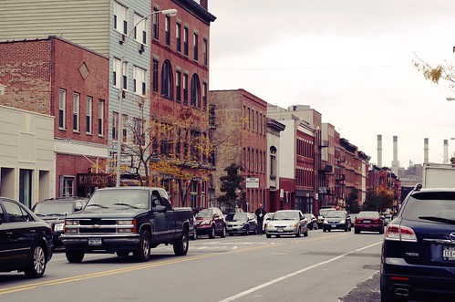
We bought a car. It was Michal's idea, inspired by an ad for a (relatively) cheap parking place. So now we are the proud owners of a dark blue BMW 3 Series from 2006. Our first drive lead us to Manhasset, Plandome, and Port Washington in the north of Long Island. Sun setting behind the frozen sea in Plandome.
December 2012
Jan. 19, 2013
Me or Stanko were sick for about half of the month, so nothing special this time. An experiment with color film and a yellow filter. From the trip to Téryho chata in Tatra mountains with friends.
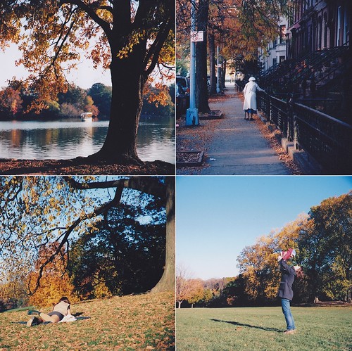
October 2012
Nov. 25, 2012
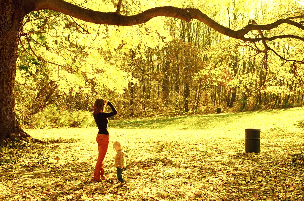
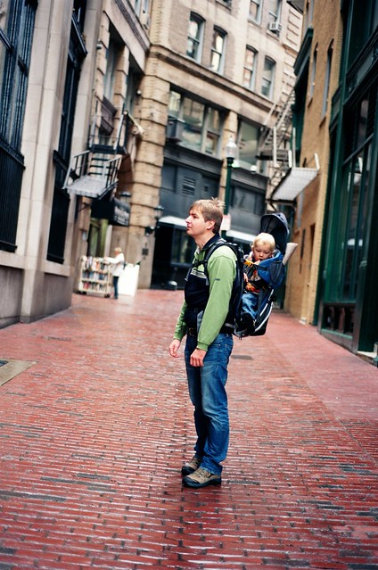
I hoped to post some wonderful foliage pictures here. And I hoped to take them in Massachusetts where we traveled around the peak of the foliage season. However, we lacked time, thus I couldn't afford waiting on a right place for the right light. The first picture is from Boston's downtown. The tilt perspective is accidental, and I like how Stanko is looking down, as if he was afraid of sliding and falling. The second photo is from MIT campus, where Stanko was exploring some piece of artwork. Next time in Boston, I really have to spend more time in North End.
September 2012
Oct. 28, 2012
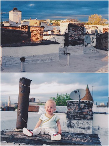
It's almost the end of October, and the hurricane is approaching. A good time to catch up with this blog. It seems that at least recently, I'm really only satisfied with the travel photos. This is probably because I seldom allow myself to be a tourist in the place where I live. Thus the first of the September photos - the framed view of the world of giant trees in Yosemite's Mariposa Grove. As for the second, it's just a quick snap from our daily life but a kind of memory I'm very glad I saved for Stanko, so that he can look at it in the future, and perhaps get the idea of how our life really was.
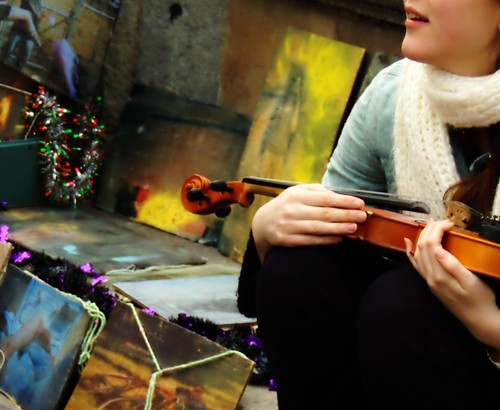
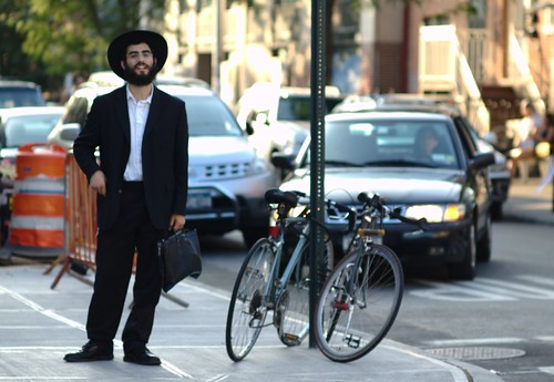
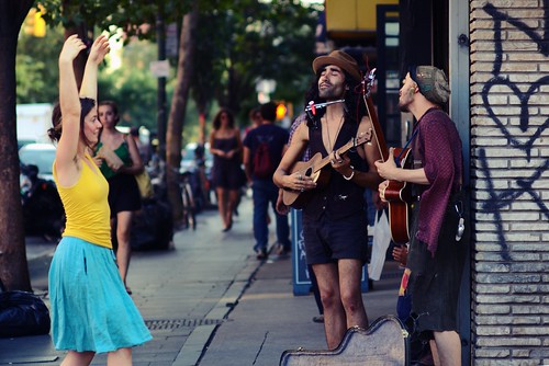
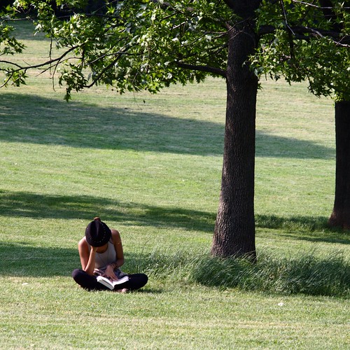
NYC
Sept. 16, 2012
This month I'm celebrating an anniversary - the third one of having a very close relationship with The City. It was all interest and excitement at the beginning, almost hatred afterwards (during one of the hottest and most humid summers recently, while being unemployed and fighting the first trimester nausea), but then it got settled somehow, and we are on good terms now. What's more, I think our relationship may be even improving or at least, I stopped the care so much about the lack of visible evidence regarding functionality improvement, and can value the effort of trying.
What helped to change my point of view, besides other things, was experiencing NYC by bike and seeing some single-street downtowns elsewhere in USA. Both helped me to realize how colorful and rich in possibilities NYC is.
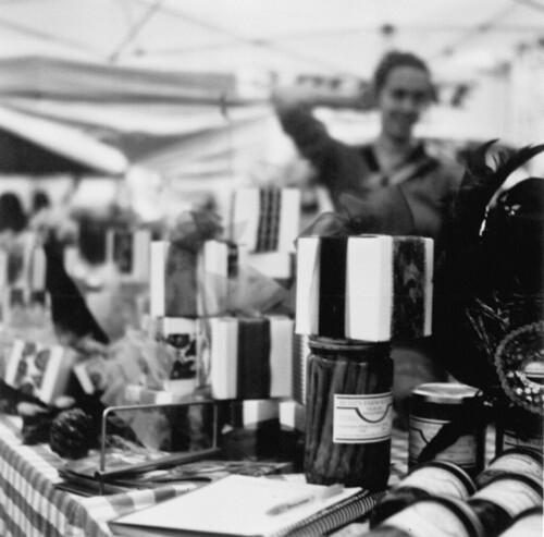
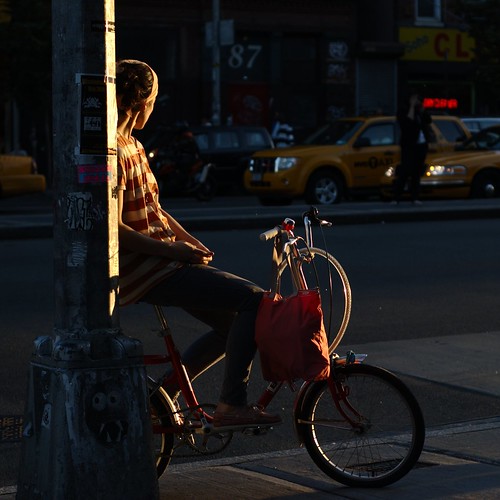
This photo quite sums it up. Shot in one of the most iconic neighborhoods of the new NYC that (non-hipster) tourists never heard about, with the famous skyline in the background, it displays what you think may be the best about living there (or here?). Here are my few takes.
the market at Union Square
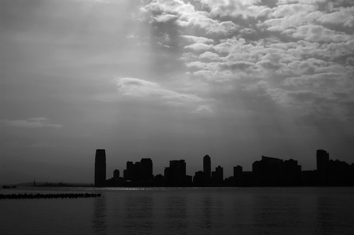
New Jersey skyline
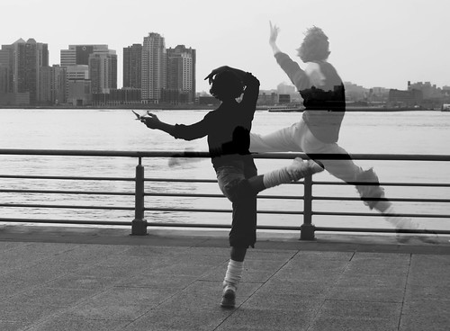
ballet practice at the shore, Manhattan west
Chelsea
Prospect Park
Greenpoint
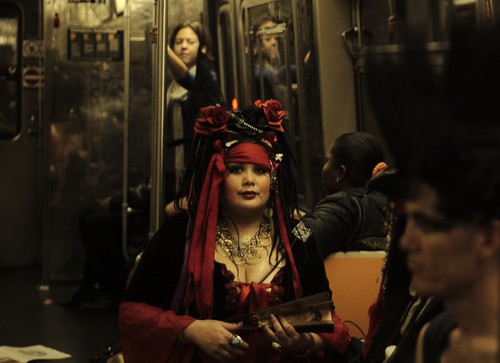
Halloween, D-train
Union Square
Union Square
Boerum Hill
Park Slope
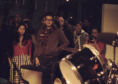
concert at Brooklyn Museum
Park Slope
Park Slope
Red Hook

NoLiTa
East Village
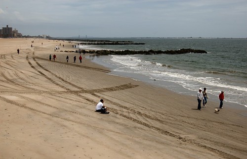
Brighton Beach
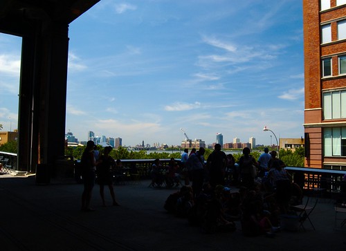
Highline Park, Chelsea
Orchard Beach, Bronx
Williamsburg
Williamsburg

Barnes&Noble, Union Square
Prospect Park
Prospect Park/Park Slope
Prospect Park/East Village

Midtown West/Brooklyn Heights
our roof, Park Slope

East Village

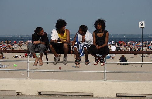
Coney Island

thrift store, Park Slope

Chelsea Market
However, I noticed that I'm taking pictures of now-my city quite a bit less than in the past. And it's something to consider, because NYC is definitely worth it.
August 2012
Sept. 13, 2012
Another big trip - and a plenty of pictures. This time we chose to travel to California, mainly to see Yosemite National Park but also other parts of Sierra, San Francisco, and the coast. I left the battery charger from my Nikon D90 in Slovakia by mistake, and my mom had to send it to NYC afterwards. It was not clear whether it arrives before we take off to San Francisco but it actually did - on the very same day. However, by that time I decided to try taking pictures the good old-fashioned way - on film rolls (I used Ektar ISO 100 for color, and Ilford FP4 ISO 125 for b&w). Unfortunately, I have a crappy scanner which in addition I forgot to clean before scanning. Some scanned images even had visible Stanko's fingerprints (he loves to open and close the cover) but those I have fixed :).
The first photo (or three of them) I've made at Travertine Hot Springs near Bridgeport on the eastern side of Sierra Nevada. They were tiny but spectacular and so was the bathing. I got very upset when I noticed that the film is not rolling, and pressed the shutter twice more in pure desperation, not knowing how to fix the problem on the spot. I don't think that the picture is all that interesting but it's the story behind it that makes it dear to me. After all, I've got a photo somewhat faithfully capturing that beautiful evening, the photo I didn't hope to have when the stuck film accident happened.
The second photo was made by Michal at Vernal Fall which even in late August was incredibly powerful. What an experience it must be to see it in April or May!
The third photo shows the iconic Half Dome. How could one forget about that one :). The whole gallery (or better said, the portion of photos I scanned) is
here.
Digital post-processing
Aug. 2, 2012
I'm far from being a photoshop/gimp guru however, this is not intended to be a tutorial for experts and pros. Just a few simple notes for beginners.
1. Proper exposure is important. No matter the powers of photo-editing software, underexposed areas are grainy, which is not at all aesthetically pleasing in digital photos. Furthermore, both over- and underexposed areas lose a great amount of detail. This seems to be much more severe in digital than in analog photos. The acceptable-exposure range of a film is larger than of a digital chip.
2. That said, it's probably better to shoot in raw than in jpeg, to mitigate the effects mentioned above. Besides other things. For post-processing, I use gimp exclusively. Raw (Nikon .NEF) photos are handled with UFRaw plugin.
3. The general rule of a thumb I use, with a few exceptions, is that less is more. What I like about photos, besides a fresh perspective, interesting composition, and proper focus where it is desired, are clean and popping colors, and the right amount of contrast, with good definition of details in black&white pictures. What I don't like are overdone HDR, skin-smoothing, and color-obscuring techniques (I speak to you, Instagram).
4. Now to UFRaw and gimp: Let's start with UFRaw. The native gamma (luminance) compression/expansion parameter 45 seems too large for my taste (too dark shadows) in most lighting conditions. I usually lower it to 40, and would go even lower but that also results in more grain. Unless the photo or some of its areas are overexposed (which is sometimes unavoidable without a proper optical filter), I mostly adjust the curve setting in the shadow range. Often the shadows seem way too dark but again, be careful because the more you deviate from the native settings, the lower is the resulting photo quality.
What I don't like about digital photos is that they look differently on each screen. Often, especially when shooting on a cloudy day, I enhance the color saturation by about 10%. For black&white pictures, the value/color curves and contrast settings can be manipulated more freely. With colors, unless the editing is selective, such approach could make colors look awkward and unnatural, like bright pink skin. I usually set grayscale mode to "channel mixer", to mimic the effect of using optical color filters (I actually bought some but am lazy to use them).
When shooting in the middle of the day, the pictures tend to have a bluish tint. Increasing color temperature comes handy. If you don't have this option directly, open "curve settings", suppress the blue curve, push up the red one. This can be applied directly to a jpeg using gimp. Most of the other edits maybe as well, but I use UFRaw. One more trick: Open Colors -> Levels, and adjust input-levels sliders to mark the leftmost and the rightmost ends of the histogram. This stretches the tone-scale to cover the entire light spectrum, so the darkest shadows become black and the lightest highlights become white. Generally, it improves the "flat" impression of the picture. There are notable exceptions, like that the mood of a heavily overcast day is better expressed using darker shades, while an image of a sunlit forest with beams of light looks better in bright tones (reference:
Bruce Barnbaum).
5. "Artistic" processing: This I usually avoid since I don't think it fits many photos. Anyway, here are a few techniques:
a) Textures: I sometimes use paper textures to give a slight "paint"-feeling to the images of towns. The paper texture and the original image are edited in two separate layers, where I play with blending modes (normal, screen, overlay), and layer opacities. I also adjust color levels to get the effect of "bold" colors of a painting.
b) Cross-process: The effect of developing a color negative in the chemicals for slides, and the other way around. I never tried it since being afraid to destroy the film. Somewhere I found the following way to mimic the effect digitally, albeit the result looks quite different from the real-thing examples I've seen: Open "Curves". For the green and the red ones, decrease shadows, increase highlights (increasing contrast), like sin x function in (-Pi, Pi). For the blue one, increase the curve in shadows, decrease in highlights (decreasing contrast), like sin x in (0, 2Pi).
c) Vintage-look: Apply the following color levels: Blue and magenta in screen mode, yellow in multiply mode. Set opacities of the first two between cca 5-15%, and of the latter one to 30-60%. This results in a faded-color, yellowish image. To increase the image definition, duplicate the original image layer, and set to overlay mode. Adjust the opacity to get the right level of definition.
Side-note: IMO, nature looks best without any "artistic" edits.
1 comment